
How do you motivate your customers to buy more online? Which features in your mobile or web app are necessary and which are just confusing? How do you design your app so that it noticeably drives your business?
Spoiler: You can achieve this not only with your offer and clever marketing, but above all with an exceptional user experience (UX).
Maybe you don’t like to book with Airbnb, because there is also criticism of the business model… But then when you want to book your vacation accommodation somewhere else, it’s somehow more complicated, more cumbersome, less clear and just not as intuitive as on… you know. That’s why you end up booking with Airbnb again. Of course, there’s often less choice elsewhere, too. But what came first, chicken or egg? UX or supply/demand?
What UX has to do with market dominance
Airbnb, like other tech giants, is a leader because its UX is great. Google has also cemented its market power with UX, among other things. You don’t have to read a manual to use the various apps from Maps to Photos to Docs to Calendar. They are intuitive to use, reliably available, always up to date – and only fulfill the exact function that the user expects from them – and they do this quite excellently.
That brings us to a very important point. Some time ago, Ackee developed a mobile app for a large, international freight forwarder. The app was supposed to take paperwork away from drivers and provide management with automated reports and a better overview for better decision-making. Those are tough audiences to match.
Why UX designers go offline for better digital results
Knowing that different audiences have very different needs and that an app’s success stands or falls on meeting them, one of our UX designers sat down in the truck with a trucking company driver for a day and literally watched him go through the motions.
This is time-consuming, but not unusual!
And in the process, we learn not only what tools the driver uses at all – even beyond the work tools – but also his emotions about it. That is, whether he likes using them or whether he grumbles because they are cumbersome and steal his time.
After the day, our colleague had a pretty good idea of how app screens and flows need to be structured so that drivers can use them easily, while having the motivating feeling that the app is really taking work off their hands.
Without a UX process – that is, without really knowing the target audience well and tailoring the app to them – there probably would have been a revolt at launch. So there was just a bit of gnashing of teeth. The target group is not necessarily open to technological innovations. In the meantime, however, the app has been running for a while, everyone has gotten used to it, and it actually reduces bureaucracy, thus saving time and facilitating management decisions.
Why a successful app is never finished
By the way, satisfaction with an app grows when user feedback is taken up and transformed into improved usability by UX designers.
This is actually an ongoing process. An app is never finished. External circumstances are constantly changing, there are new versions of iOS and Android, for example, and the app must be adapted promptly – otherwise it is deleted in a flash. Cell phone storage space is precious!
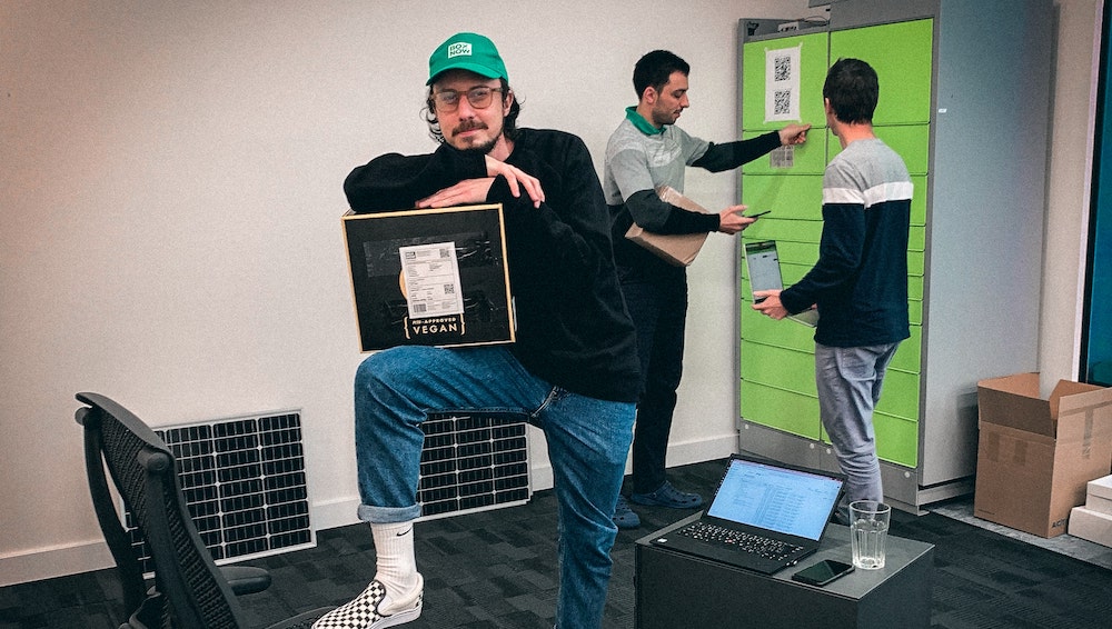
Of course, the users can also be the company’s own employees or cooperation partners. Our example involves a multinational delivery startup that delivers goods to packing stations for end customers.
In the meantime, it has become apparent that the couriers waste too much time scanning the goods in the warehouse. Another problem is that packing stations are already full. This naturally leads to great frustration among the drivers, who are often under time pressure anyway. That’s why scanning in the warehouse is now no longer necessary.
The parcels are scanned anyway when they are delivered to the packing stations – in practice, this is sufficient. In addition, the app will show in the future whether the destination packing station still has space, what alternative there is and, if necessary, immediately sends an automatic notification to the customer about the new pickup location.
We were only able to find all of this out because we gathered feedback, but above all because the company assigned someone to watch the couriers at work. So the feedback was very detailed and we knew exactly what was working and where things were sticking. In addition, we actually had our own small packing station in the office and were able to test whether all the steps in the process worked smoothly. We then improved the product in several sprints according to the feedback.
What turns customers away from buying
Another example: A common problem with web shops is that customers put products in the shopping cart but then don’t click “buy”. What do you do? This can actually have various causes. On the one hand, as a web shop operator, you want customers to buy as much as possible and then suggest other products that “go with it” or are “on offer,” but on the other hand, you want them to complete their purchase.
With this conflict of interest, many customers get lost: they get distracted, lose interest, decide differently. Sometimes it helps to make the buy button more eye-catching. Airbnb uses bright pink buttons that immediately catch the eye, on otherwise white pages with black text.
If you’re sure that all related info is meaningfully bundled for the user, the page has a clear, symmetrical layout, you’re only asking for the absolutely necessary info from your users at the absolutely necessary time, then make the button more eye-catching accordingly and watch if the data improves. If not, the only thing that helps is to ask users why they didn’t complete the purchase.
Why you need to dig deeper despite user feedback
“No matter how much effort you put in, the first solution is never perfect. You always have to do some trial and error and figure out how to make it work better. Then, through repeated iterations, you get to the ideal user experience. The key is to really listen to users and understand their actual needs,” Roman Gordienko, Lead UX Designer at Ackee.de.
As US automotive pioneer Henry Ford noted 100 years ago, “If I had asked people what they wanted, they would have said faster horses.”
Pictures: Copyright: Ackee.de
Author:
Michal Mikolaj is Senior UX Designer at Ackee.de. Ackee has been developing apps for the German Bundestag, VW WeShare, Ethereum, FlashSports etc. Successful apps are always based on an excellent UX
Statements of the author and the interviewee do not necessarily represent the editors and the publisher opinion again.
